
2023
Primed.
An educational, interactive website that covers topics related to women's health including menstruation, hygiene, and sexual education.
The goal of this project is to acknowledge the impact of period poverty and provide ways to counter the social issue.
Users can go through self-guided modules on each topic. Information is presented in different media types including text, image, and video.
Topics covered include menstruation, anatomy, puberty, hygiene, doctor's visits, and further supportive resources.
This was created in collaboration with Emily Kuntz.
Role : Researching, Prototyping, Designing
Time : Semester Long (4 months)
Tools : Balsamiq, Figma, Webflow
Problem
Younger children, teens and even young adults have not gotten the necessary to information from schools or parental figures.
The limited health education can contribute to real world problems including making uninformed and dangerous decisions and period poverty.
-
According to a 2021 online survey of U.S. teenagers by SKDK, 76% of students associate periods with something unsanitary and 65% agree that society teaches people to be ashamed of their periods.
-
Seven in ten (68%) people agree that period poverty is a public health issue, but only 4% of Americans are aware of a local resource where free or reduced-cost period supplies are available. (Alliance for Period Supplies)
Design Process
Research
Sketch and Wireframe
Test and Revise
Design
Research
Through my research, I found that there was not an already existing website or mobile app that focused primarily on women's health topics and sexual education for children and teens. The closest applications I found are either period tracking apps or educational websites that cover a large range of health topics. Overall, the most common issues were:
-
Minimal content blocked by paywall
-
Constant ads popping up
-
Overwhelming and cluttered UI design
-
Not catered to younger audiences

Clue Period Tracker

OKY Period Tracker


Brain Pop
Period Tracker Deluxe
Users
While we could conduct research to provide insights for this project as college students, we still understood who the intended audience was.
Students
Students from middle school into high school who are experiencing the topics discussed for the first time.
Young Adults
Those who may not have had an adequate education in the past or are experiencing these topics for the first time.
Parents
Those who may not feel comfortable covering topics themselves for their children or are not as knowledgeable.
Low Fidelity Wireframes
We explored how users would navigate the website and modules since it is self-guided. The home screen explains the purpose behind the website while providing users with two ways to get to the modules, like from the menu dropdown or slideshow at the bottom. On the module page, we considered how the user may want to learn, whether it be a video first and then text expanding on the information and vice versa.


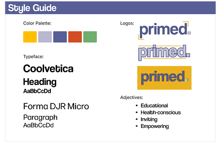
Style Guide
After agreeing on the organization of the pages, we decided on color and typography. Since this is a learning tool for everyone regardless of age or gender, we did not want to include colors associated with a specific gendered identity. To make the website visually interesting, we chose a colorful and vibrant color scheme that most educational websites utilize.
For the typeface, we chose sans-serif fonts that are easy to read but still interesting to look at.
Testing
After interviewing 6 participants, we decided to give the user the option to start with the video or text for each module. Also, we included the sticky notes as part of the design because participants found it matched the theme of an educational resource.
Final Prototype

Learning Module - Video
If the user chooses to start with the video, they will be directed here. At the top of the page there is a definition of the concept they are learning about. There is a pop up that explains colored words can be pressed to hear their pronunciation, since this may be the first time some users are encountering them. A transcript for the video is also provided accessibility. Once the video is done, the user can move on to the text for a more in depth lesson.


Resources
The resource pages provides users with a list of relevant contacts and websites that could provide assistance if necessary. While a tool for learning, this website can cover topics that may be difficult for some users so we wanted to make sure they were supported as well. We wanted to be as inclusive as possible so it can be used by many people of different backgrounds.
Home Screen
The landing page of the website gives a short description of what primed can be used for. The menu allows users to interact with the different learning modules, resources page and ways to contact and give feedback to us, the creators. At the bottom of the screen is the slideshow where the user can choose which module they would like to start with.
After choosing, a question will appear asking if they would like to start learning with the video or text provided.

Learning Module - Text
The text page provides a thorough explanation of the concept covered. The colored words in throughout the text can also be clicked to provide pronunciation. Users move through the module using the arrow buttons to move backward or forward.

Reflection
As my first case study, overall there are a lot of things that could be improved in terms of presentation and design. If I were to continue to develop this project, I would cover more topics and add quizzes and games at the end of each module to make it more enjoyable to use. It would become a resource that could be used in schools to supplement their cirrculum.