

_edited.png)
2023
Dollar Sense
A mobile application that aims to uplift teens and young adults through financial literacy, management, and support.
This educational app covers a multitude of financial topics that can help a person become financially stable and confident.
Dollar Sense is like a personalized financial coach that can be taken on the go as it caters lessons to a person’s specific goals.
This gamified approach makes building better budgets and making smarter investments engaging and enjoyable.
This was created in collaboration with my peers.
Role : Researching, Prototyping, Designing
Time : Semester Long (4 months)
Tools : Google Forms, Figma
Problem
Every day people work hard and save in order to live comfortably and prepare for the future. Unfortunately, most people are not well equipped with the financial literacy they need to navigate this demanding world.
This lack of financial literacy can translate into real-world consequences. This can include high debt burdens, poor credit scores, and the inability to build long-term wealth.
In 2023 alone, Americans lost an average of $1,506 due to a lack of knowledge of personal finances according to the National Financial Educators Council.
Most college students and recent grads suffer from problems like a lack of understanding about credit, food and housing insecurity, and difficulty focusing on academics thanks to financial stress.
Design Process
Research
Sketch and Wireframe
Design
Research
Through some research, we found that there are a few financial literacy tools in different forms including apps and websites. Most, including the ones listed here, focused on presenting educational content to help users grow their savings. We also found that most of them did not provide a personal experience based on what the users needed.


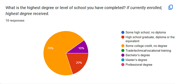
Survey
After defining the problem and completing competitor analysis, I conducted a research study in the form of a study to understand what our intended users knew and what they wanted to learn. The survey gathered responses from 10 recipients with ages ranging from 18 to 34 years old.


User Persona

Low Fidelity Wireframes

Style Guide
After agreeing on the organization of the pages, we decided on color and typography. Since this is a learning tool for everyone regardless of age or gender, we did not want to include colors associated with a specific gendered identity. To make the website visually interesting, we chose a colorful and vibrant color scheme that most educational websites utilize.
For the typeface, we chose sans-serif fonts that are easy to read but still interesting to look at.

Final Prototype

Home/ Dashboard
Once a user is logged into their account, the dashboard will appear on the screen. This page will address the user by name and tell them how long their streak, or days consecutively using the app, is.
There are daily challenges that are the same for every user that can be completed with rewards and badges. Below daily challenges are the specific user’s personalized tasks, which are catered to them based on the financial goals they input to create their profile. The user can press the arrow next to each task where they will be directed to the lesson.
At the bottom of the screen is the navigation bar, where the user can access the dashboard, lesson categories, leaderboard, and profile.

Lesson Modules
Here, users can choose whatever financial lesson they would like to start or finish. The user can go in whatever order interests them the most.
Once a category is in progress or completed, there will be a blue outline and percentage to show their progress. If it has not been started, a gray outline will appear. Users can also search for a specific topic to make it easier to access.


Log In Screen
When the user first opens the app, they will be presented with the Dollar Sense logo and slogan: “Unleash your financial superpower!”.
Users may log into an account they have already created or create a new one. They will have to enter an email or phone number along with a password to enter. After successfully creating an account, their preferences and progress will be saved as they use the app.

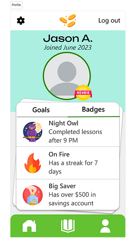
Profile
The profile page consists of the information the user put in when they first created their account. It shows their proficiency level, the financial goals they set, and the badges they have earned through their lessons. When the user completes a goal, they can click the checkbox next to it to make it disappear.

Lesson Page
Once a user chooses a category to complete, they will be taken to the lesson page. The lesson will have short instances of relevant information that is easy to understand with helpful visuals.
After each section, users will complete a short quiz about the content they just viewed. Users gain badges as they progress through the lesson.
Reflection
I believe I could improve this project more but I was not adle to conduct usability testing due to the time frame and nature of the class I created this design for. Feedback is an essential part of the design process. Other than that, I leaned how thorough research can help shape a better solution.